On the third of March a meeting was organized by Improve Quality Services (my employer) and the Federation of Agile Testers in Utrecht, the Netherlands. The evening featured James Bach as speaker and his talk focused on the paper A Context-Driven Approach to Automation in Testing, which was written by him and Michael Bolton. My favorite part of the evening was the part during which James tested some functionality of an application and explains his way of working. He provided such a demonstration a year ago when introducing the test autopsy.
The exercise
 This time around the subject under test was the distribution function of the open source drawing tool Inkscape and the focus was on the usage of tools to test this functionality. It must be said that Inkscape lends itself to the usage of tools because it stores all the images that are generated using this tool in the Scalable Vector Graphics (SVG) format, which is an open standard developed by the World Wide Web Consortium (W3C). This greatly increases the intrinsic testability (links opens PDF) of the product, as we will see.
The SVG format is described in XML and as such, the image is a text file that can be analyzed using different tools. It is also possible to create text files in the SVG format that can then be opened and rendered in Inkscape. As such, the possibilities for creating images by generating the XML script using code are virtually limitless. Before the start of the presentation James had created a drawing containing 10,000 squares. He created this drawing using some script (I am not sure he mentioned in which language this script was written). My initial reaction to James showing the drawing that he generated was one of astonishment. I was impressed by his idea of testing this functionality with 10,000 squares, by the drawing itself and the fact that it was generated using a script.
Impressed by complexity
Looking back, my amazement may have been caused my lack of experience with Inkscape and the SVG format. But it also reminded me that it is easy to be impressed by something new and especially if this new thing seems to be complex. I believe that, in testing, if you really want to impress people — for all the wrong reasons — all you need to do is to present to them a certain subject as being complex. People will revere you because you are the only one who seems to understand the subject. The exercise, as James walked us through it, seemed complex to me and this is what triggered me to investigate it.
So why use ten thousand squares?
I am sure it was not James’ intention to impress us, so then the question is: why would he use ten thousand squares? Actually this question occurred to me halfway through doing the exercise myself, when tinkering with the distribution function. Distributing, for example, 3 squares is easy; it does not require a file generated with a script. Furthermore, it is easy to draw conclusions from the distribution of 3 squares. Equal distribution can be ascertained visually (by looking at the picture), with a reasonable degree of certainty. So if equal distribution functions correctly with 3 squares, why would there be a problem with 10,000 squares? I am assuming that the distribution algorithm does not function differently based on the amount of input. I mean, why would it? So, taking this assumption into account, using 10,000 squares during testing does only the following things:
- It complicates testing, because it is no longer possible to ascertain equal distribution visually.
- Because of this, it forces the tester to use tools to generate the picture and to analyze the results.
- It complicates testing, because the loading of the large SVG file and the distribution function take a significant amount of time.
- It tests the performance of the distribution function in Inkscape.
Now the testing of the performance is not something I want to do as a part of this test. But it seems that working with 10,000 squares adds something meaningful to the exercise. A distributed image generated from 10,000 squares does not allow for a quick visual check and therefore simulates a degree of complexity that requires ingenuity and the use of tools if we want to check the functioning of distribution. Working with large data sets and having to distill meaning from a large set is, I believe, a problem that testers often face. So, as an exercise, it is interesting to see how this can be handled.
A deep dive into the matter
Some of the tools I use
- Inkscape (for viewing and manipulating images)
- Python (for writing scripts)
- Kate (for editing scripts and viewing text files)
- KSnapshot (for creating screen shots)
- Google (for looking up examples & info)
- R (for statistical analysis)
In an attempt to reproduce James’ exercise, I create a script to generate this drawing myself. In order to do so, I need to find out a little bit about the SVG standard. Then I create an Inkscape drawing containing one square, in order to find out the XML format of the square. Now I have an SVG file that I can manipulate so I have enough to start scripting. I install Python on my old Lubuntu netbook which is easy to do. I never did much programming in Python before. I could have written the script in PHP or Java, which are the two programming languages about which I know a fair amount, but it seems to me that Python is fairly light-weight and suitable for the job. It can be run from the command line without compilation, which contributes to its ease of use.
So I write a Python script that creates an SVG file with 10,000 squares in it. Part of the script is displayed below. I look up most of the Python code by Googling it and copy-pasting from examples, so the code is not written well, but it works. I can run the script from the command line and it generates the file in the blink of an eye. The file size of the file is just about 2.4 Mb, which is fairly large for a text file and when I open it using Inkscape, the program becomes unresponsive for a couple of seconds. Apparently the program has some difficulty generating the drawing, which is understandable, given that the file is large and the netbook on which I run the application is limited in both processing power and internal memory (2 Gb). Yet, the file opens without errors and shows a nice grid of 10,000 squares.
Python script for creating the squares
with open('many_squares.svg', 'w') as f:
    f.write(begin)

    x=0
    y=0
    offset = 12
    number_of_squares = 10000

    while number_of_squares > 0:
        square = '''<rect
        style="fill:none;fill-rule:evenodd;stroke:#000000;stroke-width:1px;stroke-linecap:butt;stroke-linejoin:miter;stroke-opacity:1"
        id="rect3336"
        width="10"
        height="10"
        x="%d"
        y="%d" />''' % (x,y)
        if x + offset > 800 :
            y = y + offset
            x=0
        else:
            x = x + offset
        f.write(square)
        number_of_squares = number_of_squares -1
    f.write(end)
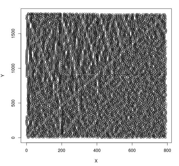
Which results in the following picture.
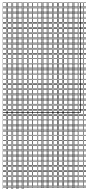
The regular grid of 10,000 squares created with the Python script

A close up of the grid created with the Python script
The Inkscape distribution functions
I now have a grid of 10,000 squares with which I am trying to reproduce James’ exercise. The thing that I run into is that Inkscape has a number of distribution options. I am not sure which distribution James applied, so I try a couple. None of them however show as a final result the image that James showed during his presentation – as far as I can remember it was an oval shape with a higher density of objects near the edges. Initially it seems strange that I am unable to reproduce this, but through tinkering with the distribution function, I conclude that the fact that I am unable to reproduce James’ distributed image probably depends on the input. The grid that I create with the script contains identical squares of 10 by 10 pixels, evenly spaced (12 pixels apart) along the x and the y axes. It may differ in many aspects (for example, size, spacing and placement of the objects) from the input that James created.
Developing an expected result
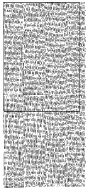
I apply the Inkscape distribution functionality (distribute centers horizontally and vertically) to my drawing containing the 10,000 squares and the result is as shown below. The resulting picture looks somewhat chaotic to me. I cannot identify a pattern and even if I could identify a pattern, I would not be sure if this pattern is what I should be seeing. There seem to be some lines running through the picture, which seems odd. But in order to check the distribution properly, I need to develop an expected result, using oracles, by which I can check if the distribution is correct.

The entire distributed drawing
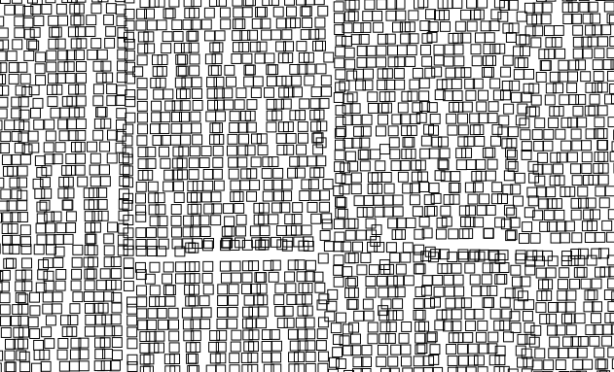
A close up of the distributed drawing (it kind of looks like art)
I do several things to arrive at a description of what distribution means. First I consult the Inkscape manual with regards to the distributions functions that I used. The description is as follows.
Distribute centers equidistanly horizontally or vertically
Apart from the spelling mistake in the manual, the word that I want to investigate is ‘equidistant’. It means — according to Merriam-Webster —
of equal distance : located at the same distance
Distance is complex concept. The Wikipedia page on distance is a nice starting point for the subject. I simplify the concept of distance to suit my exercise by assuming a couple of things. My definition is as follows: Distance is the space between two points, expressed as the physical length of the shortest possible path through space between these points that could be taken if there were no obstacles. In short, the distance is the length of the path in a straight line between two points.
There are other things I need to consider. The space in which the drawing is made is two dimensional. This might seem obvious, but it is important to realize that every single point in the picture can be identified with a two dimensional Cartesian coordinate system. In short, every point has a x and a y coordinate (which we already saw when generating the SVG file) and this realization greatly helps me when I try to analyze the picture. Another question I need to answer is which two points I use. This is tricky, because in my exercise, I used the center of the square as reference point for distribution. Since I am dealing with squares, width and height are equal and since all the squares in my drawing have the same width and height, I simplified my problem in such a way that I can use the x an y coordinates of the top left corner (which can be found in the SVG file) of each square for further analysis. There is no need for me to calculate the center of each object and do my analysis on those coordinates.
And lastly I need to clarify what distribution means. It turns out that there are at least two ways to distribute things. I came across an excellent example in a Stack Exchange question. In this question the distinction is made between spreading out evenly and spacing evenly. To spread out evenly means that the centers of all objects are distributed evenly across the space. To space evenly means that the distance between the objects is the same for all objects. The picture below clarifies this.
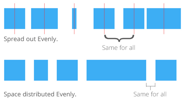
Types of distribution (source: Stack Exchange)
In my special case — I am working exclusively with squares that are all the same size — to spread out evenly means to space evenly. So the distinction, while relevant when talking about distribution, matters less to me. Aside from the investigation described above, I spoke with several co workers about this exercise and they gave me some useful feedback on how I should regard distribution.
To make a long story short, my expected result is as follows.
Given that all the objects in the drawing are squares of equal size, if the centers of all the squares are distributed equally along the x axis then I can analyze the x coordinates of the top left of all squares. If the x coordinates are sorted in ascending order, I should find that difference between one x coordinate and the x coordinate immediately following it, is the same for all x coordinates. The same should go for the y coordinates (vertical distribution).
This is what I’m looking for in the drawing with the distributed squares.
Some experiments in R
In order to do some analysis, I need the x and y coordinates of the top left corner of all the squares in the drawing. It turns out to be fairly easy to distill these values from the SVG file using Python. Again, I create a Python script by learning from examples found on the internet. The script, as displayed below, subtracts from the SVG file the x and y coordinates of the top left corner of each square and then writes these coordinates to an comma separated file (csv). The csv file is very suitable as input for R.
Python script for generating the csv file containing the coordinates
svg = open("many_squares_distr.svg", "r")

coordinates = []
for line in svg:
    print line
    if line.find(' x=') <> -1 or line.find(' y=') <> -1: # line containing x or y coordinate found
        positions = []
        for pos, char in enumerate(line):
            if char == '"':
                positions.append(pos)
        print line[positions[0]+1:positions[1]]
        if line.find('x=') <> -1 :
            x = line[positions[0]+1:positions[1]]
        if line.find('y=') <> -1 :
            y = line[positions[0]+1:positions[1]]
            new_coordinate = [x,y]
            coordinates.append(new_coordinate)

with open('coordinates.csv', 'w') as f:
    point = 1
    line = line = 'X,Y\n'
    f.write(line)
    for row in coordinates:
        line = '%s,%s\n' % (row[0],row[1])
        f.write(line)
        point = point + 1
Now we come to the part that is, for me, the toughest part of the exercise on which I consequently spent the most time. The language that I use for the analysis of the data is R. This is the language that James also used in his exercise. The language is entirely new to me. Furthermore, R is a language for statistical computation and I am not a hero at statistics. What I know about statistics dates back to a university course that I took some twenty years ago. So you’ll have to bear with the simplicity of my attempts.
It is not difficult to load the csv file into R. It can be done using this command.
coor <- read.csv(file="coordinates.csv",head=TRUE,sep=",")
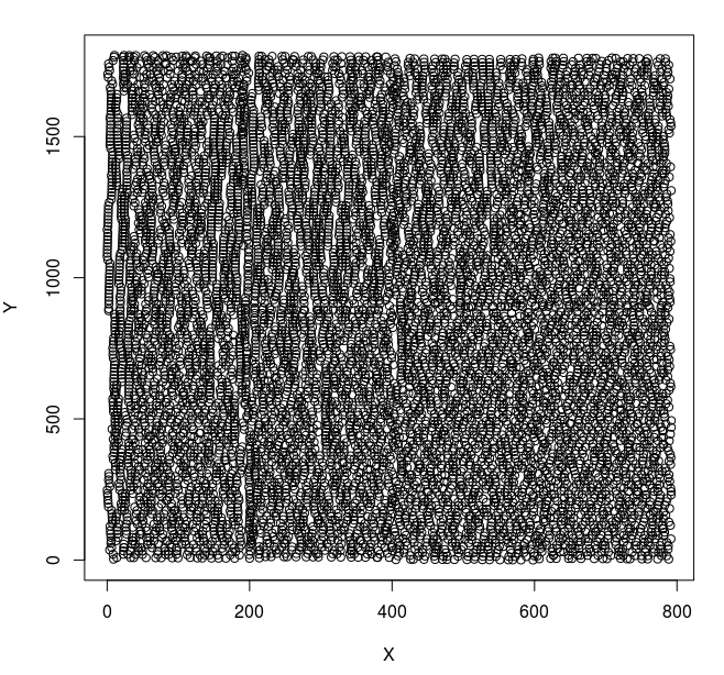
A graph of this dataset can be created (plotted).
plot(co)
Resulting in the picture below.
After that, I am creating a new dataset that only contains the x values, using the command below.
xco = coor[,1]
And then I sort the x values ascending.
xcor <- sort(xco)
Then I use the following command
plot(xcor)
to create a graph of the result as displayed below.
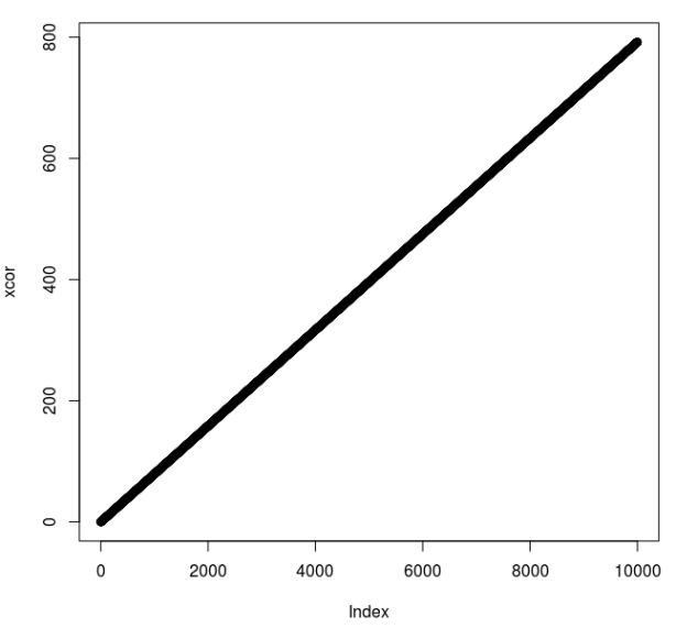
The final result is a relatively perfectly straight line because (as I expected) for each data point the (x) value is increased by the same amount, resulting in a lineair function. As a result this satisfies my needs, so this is where I stop testing. I could have created, using a Python script, a dataset containing all the differences between the consecutive x coordinates and I could have checked the distribution of these differences with R. I leave this for another time.
Afterthoughts
One of the questions you might ask is if I really tested the distribution functionality. My answer would be a downright ‘No’. I used the distribution functionality in an exercise, but the goal of the exercise was not to test the functionality. The goal was to see what tools can do in a complex situation. If I had really investigated the distribution functionality, I would have created a coverage outline and I would certainly have tried different kinds of input. Also I would have had to take a more in depth look at the concept of distribution.
One of the results of this exercise is that I know a little bit more about scripting, about the language R and about vector images. Also, I learned that the skills related to software testing are manifold and that it is not easy to describe them. I particularly liked describing how I arrived at my definition of the expected result, which meant investigating different sources and drawing conclusions from that investigation. I feel that the software tester should be able to do such an investigation and to build the evidence of testing on it. I also learned again that complexity is a many headed monster that often roams freely in software development. Testers need to master the tools that can tame that beast.
Some exploration took place in the form of ‘tinkering’ with the distribution function of Inkscape. This helped me build a mental model of distribution. Furthermore I toyed with R on a ‘trail and error’ basis, in order to find out how it works.
 First off, last week, I set myself a small, well-defined Kibana task, caused by the following. My team uses a Grafana dashboard to keep track of the errors that are generated in the production environment. The dashboard is shown on a wide screen television that is on all the time. Errors appear on our dashboard but it seems that we pay only marginal attention to them. The lack of interest that I noticed is a common one. It is the same lack of interest that can be observed when putting the results of flaky automated tests on a dashboard. Over time, the lack of trust in the results of these tests causes a kind of boredom, the shutting out of the false alarm. Since the Grafana dashboard does not facilitate the splitting up of the errors by root cause but Kibana does, my only task was to split up the errors by root cause and therewith increase our insight in the errors. This task was within my reach. The fact that there were some examples, created by other teams, readily available also helped.


 If there is one thing that I was forced to look at again during the last couple of weeks — during which I was preparing for the testing of software changes — it was the art of reasoning and asking meaningful questions. Though I feel confident when asking questions, and though I pay a lot of attention to the reasoning that got me to asking exactly that particular set of questions, I also still feel that I need to be constantly aware that there are questions I didn’t ask that could lead down entirely different avenues. It is possible to ask only those questions that strengthen your assumptions, even if your not consciously looking for confirmation. And very much so, it is possible that answers are misleading.